
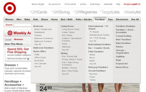
The Mega Menu is becoming a successful tool for the websites of today.
The usual drop down menu has now been improved upon. Many web developers have fought tooth and nail to avoid having to code a drop down menu. It was also a question of whether or not drop down menus were just trends. A new bigger and better drop down menu has started to pick up popularity. The Mega Menu is standing up to the web developers and is becoming a successful tool for the websites of today.
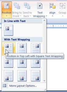
The Mega Menu is Big, has two-dimensional drop-down panels that are grouped into navigation options, they eliminate scrolling and use typography, icons, and tool tips to explain the user's choices.
Mega Menus group and organize navigational options. They are easy to read and help the design and flow of the site. Mega Menus display everything and by helping the user find more, it will help the site sell more. The Navigation choices are structured through the layout, typography and icons. It renders fast, which is an important component for the interface.
There are a few downsides to the Mega Menu. First, they cover up a lot of content when you roll over the button so if you accidentally roll over one, the content you were looking at disappears under the menu. If you have a small monitor the text on the Mega Menu could get jumbled and overlap, making it non-functional.
The Mega Menu has more Pros than cons. Done right this new menu can guide users to exactly what they are looking for.
Below are examples of some places where the Mega Menu has been successful.

The Mega drop downs are better than Regular Drop Down Menus:
It has always been suggested to use Drop down menus sparingly. This is because they can be confusing from a usability standpoint and are usually more trouble than they're worth.
A few good things about the Regular drop down menus is they conserve screen space and help the user with selections they may not know. Simple drop down menus are functional and recognizable by any user.
The Ugly
The following are types of drop down menus that can ruin your site flow and annoy your user. Interacting menus, users get confused when options come and go. Very long menus. Menus of state abbreviations, write out the entire state name. This goes for Dates as well, January looks so much better than Jan. Menus of data well known to users, such as the month and year of their birth. Users are hard wired to type in when they were born, they don’t need to see a menu of years. Lastly, Scrolling menus should not be used because the user isn’t able to see all of the information.
The following tutorials may help you in developing a Mega Menu for your next site. If you find any other tutorials on this please participate in this blog and post them.
Make a Mega Drop-Down Menu with jQuery
Get the jQuery listmenu plugin
It creates a top level alphabetical navigation menu from a plain old UL, LI or any set of html nodes. Has good options for specifying how many columns in the dropdown, was created with css-styling in mind, etc.
Tags: Web Design, General

Metrics that Matter: How to Measure Content Marketing Strategies

From Visibility to Loyalty: Content Marketing's Role in Brand Equity

Storytelling Strategies: How Content Marketing Shapes Brand Perception

Agency Launches Innovative Partnership With Palm Beach Organized

Content Marketing for Dummies: Tips, Solutions, and Considerations

2000 Palm Beach Lakes Blvd
Suite 601
West Palm Beach, FL 33409
P: 561.832.6262
F: 561.832.7707


